


Tim Abrahams is a former editor of Blueprint. He now writes for Icon, Architect’s Journal and RIBA Journal. He is also the owner of a digital publishing company and an advisor to major cultural institutions on their online strategy.
The most important object in the Freud Museum in London, where the great psychoanalyst lived for just one year before he died, is clearly his couch. Draped in Persian rugs and scattered with cushions, it is on the bohemian side of mid-20th century tastes. Although insignificant in size it is impossible not to look at the piece of furniture and not think of all the dreams that have been relayed there and the neuroses diagnosed. Given that Freudian analysis prioritises relations between the subject and their parents, the familial and domestic becomes the site of the fundamental debates of existence. The couch is not just important because of his historical significance but also because of its symbolism. Anne Leibovitz has photographed it and Louise Bourgeois has exhibited alongside it.
The difference between art and design has always been hard to pin down. Before 2008 the gallery relationship between design and art passed in one direction: from design to art. The Carpenters Gallery is a good example. Established in 2004, the gallery represents artists such as Studio Job who emerges from the design world yet who make limited edition or single pieces, such as a cabinet or a commode which serve an ostensible purpose but are legible also as works of art -largely because they aren’t rectilinear, are made in small editions and cost a fortune. Prompted perhaps by the sight of modernist design pieces, made for the masses, going for high prices in auction, designers decided that limited editions were a good idea. This was the world of design art.
Yet subsequent to the economic downturn the transfer between art and design has been in the opposite direction, reverting perhaps to a more critical relationship from the art perspective on to the design world. In 2010 the Hayward’s exhibition The New Décor brought together over 30 artists from around the world who work with interior spaces and furnishings. Addressing the way we construct and populate our domestic spaces, the exhibition challenged the comfortable notion that our domestic spaces are somehow separate from the rest of the world. Full of doors, it addressed the way we have boundaries in domestic life. It took on design while rejecting the concept of “design art”.
When New Decor was exhibited in Moscow last year, the artist Alex Buldakov’s work was included in the exhibition. A similar version of the piece in the Verge exhibition in Milan, the work is a rank of files in a shelving system which look as if they have been slashed by a large beast. It owes something to the work of Mike Nelson which was exhibited in 2008 at the group show Psycho Buildings at the Hayward. This exhibition was another fundamental analysis of the idea of art and social utility but was much more an attack on the notions of boredom. Its a punk act, an attack on boredom, which Buldakov’s case is ironic given that he has been asked to remake it a number of times now.
Another piece by Buldakov highlights an important stance on the nature of art in contrast to design. His work SexLissitsky animates the work of the Supermatist Russian artist, designer and architect with the backing track of a porn film. El Lissitsky was an exponent of the idea that art must be politically and socially useful. Buldakov does not concur. “The purpose of art is not to be useful,” he says, alluding to the revolutionary social role that El Lissitsky and others proposed for art. As a result the take of this 32-year old artist on exhibiting in Milan is interesting: “Design has a purpose and art does not.”
The exhibition Verge shown alongside the Be Open Future conference was in many ways a more brutal, more confrontational exploration between the ideas of artistic autonomy versus social utility. On a much smaller scale and covering younger artists solely from Moscow, Verge instead showed the refreshing clarity with which Russian designers view the social function of both art and design. Mikhail Koslapov’s work featured a frenetic pack of corroded scarlet computer mice quivering in a cluster or herd. He adds a further distinction. “Design has a client and art does not,” he states.
Asked to comment about the nature of an art market which is dominated by the tastes and spending power of a limited number of art-buyers, Koslapov whose work on show in Milan created an organic form from melted computer mice and red enamel, insisted on the distinction, between agent and end-user. “Pushkin”, he says, “said it was impossible to sell inspiration but it was possible to sell the script.” And yet there is a resonance and charge to the exhibition. These artists may not consider themselves a school. They may not have even been friends previously but there is a certain pop-art power to the way the language of the everyday has been appropriated and critiqued.
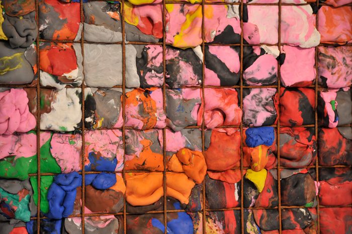
Irina Korina’s work involves the forcing of layers of plasticine into metal grids, which gives the effect of a hugely constrained sense of vitality and difference bursting at the seams. Now the artist is beginning to think at some of the ways in which she uses design. “You can really tell when they were made, they are both expressions of the time,” she says. Indeed the work in Verge is imbued with the spirit of the age, particularly in technological terms thanks primarily to the work of Electroboutique who have recently exhibited at the Science Museum in London.
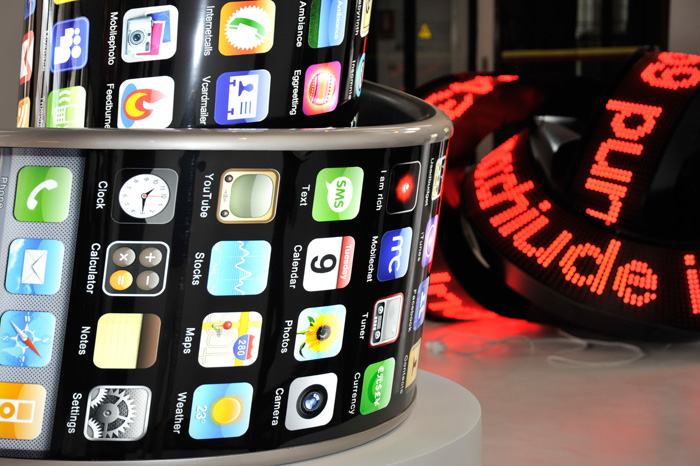
The Russian critic Valentine Diakonov has given an excellent analysis of the singular relationship that Russian artists have to the idea of social fucntion. He describes the Artists in Industries movement in which Constructivist artists designed furniture and explains that Vladimir Tatlin designed a bench to encourage collective rather than individualistic repose. Electroboutique have created, (let us not say designed) an iPhone in the shape of the Tatlin Tower called knowingly the 3G International. What is more revolutionary it prompts us to wonder? An eternal unrealised image of revolution or a ubiquitous piece of technology which allows us to control our lives to a greater degree?
Alexei Shulgin who together with Aristarkh Chernyshev forms the collective, studied satellite engineering at technical university but always wanted to be an artist. “After university I started playing with different images, visual languages, and to connect technical applications with aesthetical and art ideas,” he says. A twisted LED display, the parts of which were made in a factory but which were designed and assembled in their studio, is a symbol of the times. “So much happens in the world, something in China, something in the Middle East every time we get this news it seems simple but its a complicated situation.”
The collision between the worlds of usefulness and obsolescence, between handmade and technology, is often particularly brutal in these works. It is like wandering around the Red October chocolate factory on Bolotony Island in Moscow: artists walk to their studios in the morning as the clubbers stumble out into the sun, staring at their iPhones with the incessant electronic rhythms continuing behind them. There is a harshness of juxtapositions in this work which prefigures where Europe is heading in social, aesthetic and technological terms.
When she was asked to address the intersection between art and design, curator Yelena Selina says she was not daunted because she knew the work was there. “When we thought about it, we thought we had it already. Each artist worked in their own way, the very idea of any kind of dialogue or reference was new but we realised if we had a bigger space we could show a bigger exhibition.”